Visar inlägg med etikett #AlexanderLingtorp. Visa alla inlägg

måndag 9 mars 2015

Think-aloud with my parents

For this think-aloud I sat down with my parents, one at a time and observered how they interacted with our design prototype. All the testing was done on a live iPhone running the prototype.

The main goal of this test is to see if the workflow of the application is working as we intended from the start. If that turns out to work then we have a foundation to build the other designs upon. There is huge win if the workflows on the different platforms are the same.

I made the following introduction to both of the testers.

"The product you are about to use is a museum visit planner. It takes what you like and need from a museum and calculates a personal route for you.

The only thing you need to remember during this is to say everything you think, even if it is gibberish. All feedback is written down and condensed. Here you go!"

Mom

Mom started out looking for help boxes and stuff in order to figure out how to use the application. She seemed a bit afraid to test around and was scared that she might ruin something. But after a few clicks she figured our how the main procedure worked. Below are the problems that arised.

Question marks/Problems

  • No helpful text
  • Needed to poke around
  • No animations made for confusion during transistions
  • Some colors caused some confusion
  • Button unclear if text or a button

Notes

  • Tester seemed to understand the workflow after a couple of minutes.
  • Low quality textures, icons, pictures, weird colors, all distractions.
  • Understood where it was going in terms of value towards the user, might not have found it.

Dad

Dad was a bit more aggressive in the way he handle the application. He started clicking around and exploring. This caused a tad bit confusion as he drifted between the two main views and had a hard time understanding that this was all of the application. After that epiphany he started on the main procedure. Below are the problems that arised.

Question marks/Problems

  • Unclear directions
  • No direction text
  • Lack of options
  • Minor stutters
  • No animations
  • Weird color combinations
  • Hard to interpret icons

Notes

  • Tester seemed to understand the workflow after a couple of minutes.
  • Low quality textures, icons, pictures, weird colors, all distractions.
  • Did not see the point of the application
  • Hard time seeing the workflow as a process

Update on prototypes #3

Yesterday, 2015-03-09, the group finished the second iteration of the highfidelity prototype for the companion application. The remaining prototype; the website and printout, still needs their second iteration.

These pictures are user interface screenshots from Xcode showing real UI files which will run on the iOS platform. The idea is that other platforms shall replicate this design to the pixel.

We have established the main pipeline in which the user experience shall travel through. In order to include as many target groups as possible we wanted to keep the number of views and UI elements down to a minium without causing confusion. Therefore we went with one workflow/procedure and two main views.

First we have a main screen which is the general search view. This aims to eliminate which type of museum the user wants to visit. It can vary from art to ecologi.

This view shall be one of two consistent views. The other one is where your personal route is displayed. When not displaying a personal route that view shall redirect to this one, thus gently pushing the user towards making a new route. These two shall always be within one click.

 The second view which shall be presented after the first main view is the options view. This is where the small details in the visit is nailed down. These factor may include things like; children friendly, open today, has WiFi, has a cafe, has warderobes, price, opening hours/days, distance from the user, time to travel to museum, et cetera.
This view is where the generated routes are displayed to the user after all the requirements are inputed. As it is right now the back buttons do not show but are included in our design so that the user can at anytime during the procedure go back and redo some of the inputs. They are also able to cancel the creation at anytime.

This is a rough mockup how a typical personal route might be displayed. The idea behind the map is to have a sort of slide up motion to bring the map into fullscreen. On the map itself the route is displayed with an option to hide/show it as an overlay. This is the second main view which shall always be present.


söndag 1 mars 2015

Update on prototypes #2

Before exercise #4 we made some high-fidelity prototypes for the companion app for the design Route Planner.

Below is the first screen which will be the first thing you encounter. The purpose of this screen is to sort the routes presented in a general fashion. There is no reason to show a natural science museum to someone who is looking for a history museum.


There is a very simple and crude representation of how a detail view of the personal route could look like. The main things are here; the basic information, personal map of the route and some pictures. 


Feedback from Exercise #4

During the fourth exercise we presented our designs and progress so far. The feedback inspired a couple of ideas for our design "Route Planner", which is by the way still a placeholder name. This post is about some ideas and concepts.

Feedback

One of the important aspect of the Route Planner is to provide the user of the service a better and faster experience than what they could have manually searching for all the information brought together by the service. This goal is pretty easy to achieve but to maintain high quality content on such a service the need for user-generated feedback, such as comments, are a nice feature for both the user who expresses herself and the receiver.

Target Groups

After the presentation one in the audience said that tourists are a nice fit into our target group. This statement is completely true and to be honest our group hadn't thought about all the tourist because we simply did not see any during our field studies. This also brings up a flaw in our field studies, we missed the high season for museums. The people going to museums spike in the summer as the rush of tourists flood the city. This made us miss a whole target group. But to our defence the Route Planner is by design made to fit every one who wants to go to a museum. This will hopefully be achieved by good interface design in the outlets (website + companion app + printout).

Like Trivago for museums            

Thinking ahead we sat down and thought about ways to monetise this service. I narrowed it down to pretty much three and a half options. 


  1. Trivago
This option is to model the entire business as the trivago model. In order to fill the service with information and data (pictures, et cetera) we could make it in such a way that the museums pay us to be featured on our service. The prerequisite is that the museum itself provides us with high-quality assets and such for the routes. Basic information will also be included in this bundle. This information could include; opening hours, prices, nearest subway station, and such. 

The approach has a couple of nice things going for it. For starters it is simple to understand and liberates us from the job to generate content for our service. We will just process their information and thus bring value to the end user. 

There is one main problem with this approach, that being the sale of our service to the museum itself. Why should they want to pay us anything when we do not have anything to show for it. 

   2. Curated

This approach is simple and dirty. We will bring in the information from the museum by visiting them. After this we will need to bring ads onto the service, which represents the 'dirty' part.


Below is the raw notes I took during the exercise.


FEEDBACK
            * FEEDBACK SYSTEM   (+ COMMENTS/USER GENERATED CONTENT!?!/WIKIPEDIA STYLE??)
            * TARGET GROUP: TOURISTS? (+ INCLUDE "This might interest you")
            * LIKE TRIVAGO FOR MUSEUMS VS CURATED SYSTEM ( One OR the other )
                - THEY JOIN OUR NETWORK, WE CHARGE THEM A SMALL FEE TO APPEAR ON OUR SITE. (SNOWBALL EFFECT .. SLOW)
               ( - WE CURATE AND GATHER INFORMATION -- ADS == MONEY)
               ( - AD-SUPPORTED ? On mobile, web and perhaps printout? )
               ( - SELL USER INFORMATION )
        
            * ALTERNATIVA RUTTER: 1) Speed/Crucial 2) All-of-it 

måndag 23 februari 2015

Reading Seminar #2

Here are notes to the second reading seminar! I have some points I really want to bring up and discuss plus somethings I want to highlight, hence the bulletpoints.

  • Conceptual model are best done with wireframes, which is what we in our team have been doing. They are really great at giving you an overview over the product. This is what we instantly did when tasked with designing the website for our conventional design from last exercise (the Route Planner thingy). (page 409, chapter. 11)
  • What functions will the product perform? In the course literature we have this interesting scenario in which a travel service is discussed. The authors point out how difficult it is to draw a line and say here the point in which we do not let our program/service do more stuff. It is all about defining the boundaries. Deciding this is called task allocation. (page 408, chapter. 11)
  • After the design stages we will need to evaluate our designs and get feedback from users of our prototypes. Therefore it is good to have some iterative workflow to rely on. The course literature brings up one good example of just such a workflow. The first part is to make a field study and get some early feedback then make some design changes. The second part of this is to test the design changes in some sort of usability test with users then go back out on a field study after which you will do one last design change phase. This is something we might do in with our designs. 
  • The DECIDE framework to evaluation seems to the way to go. The framework consist of the following points. One main thing to take away from this framework is that the order does not matter. It is consider to be iterative and able to go backwards and forwards. I for one think this is a good starting point for the next step in our designs.
    • Determine the goals.
      • Who wants it and why?
      • High-level goals?
      • Determine the scope of the design.
    • Explore the questions.
      • Why are the trends as we see them?
      • How is X more/less/etc for the users?
      • Be specific; Is the menus difficult to navigate? Not enough feedback? Et cetera ...
    • Choose the evaluation methods.
      • What data do we want/got?
      • How do we want our data?
      • Theories? Frameworks?
    • Identify the practical issues.
      • Pilot study!
      • Unpredictable events/consequences 
    • Decide how to deal with the ethical issues.
      • See ethical codes
      • Privacy, etc ...
    • Evaluate, analyze, interpret, and present the data.
      • Reliability; how well it produces the same results under different times, etc ...
      • Validity; consider if the evaluation method measures what the intent to measure was.
      • Ecological Validity; this part is about how the evaluation method might corrupt the results. Placebo is an excellent example in this subcategory.
This is me! In case you forgot to check the link last time! :-)

fredag 20 februari 2015

Parallell Design Update #1 - Conventional

Parallell Design - Conventional

While at this weeks exercise we were tasked with a brainstorming session. During this brainstorming we came up with a bunch of ideas and crazy things. This post is going to cover the first of these two design,  the conventional one. 

Our design is a website + companion app + printout in which you get a personal route in a awesome museum. The route is planned after all of your preferences; childsafe, contains a cafe, X km away, Y minutes away, history, technical, natural sciences, etc. Each museum needs to be indexed by someone, probably us, so that we might provided a route in the appropriate museum. So the design is really two parted; first it shows you which museum you might be interested in and then second gives you a more personal route inside that museum. A nice bonus is that all the information you will need for your visit in beautifully bundled together with your route thus delivering a complete experience.

In order to target people of all ages we will need both a website, a companion app and a analog version (a.k.a a printout).


This is the notes from the brainstorming session and the more detailed notes of our design.

As you can see we have not yet decided on a name yet but we do have a few candidates.

This is a rough sketch showing a example of a planned route. This sketch is made by Leif S, the rest is me (Alexander L.) and Kenneth R.

The plan is that the solution/design/website can give you a personal map of the museum based on all of your preferences.

This shows a rough sketch over the website interface and a few elements/views.

We are doing a very simplified design as our target audience for this website is extremely broad. This also has the effect of reducing our workload. 

This sketch shows the next views after our introduction/pop-up view.

tisdag 17 februari 2015

Personas from 17/2 group meeting


Today's group meeting went good and we came up with 2 personas with a few scenarios. 

Tobias “Tubbe” Samuelsson Profile


Tobias “Tubbe” Samuelsson is 43 years old with no children.  Since Tobias graduated from High school he’s been working at the museum. He started working in the reception and now, years later he is in the position museum manager. He is feeling proud over his accomplish with working his way up in the museum hierarchy. Tobias is confidence with working in every position at the museum and has a good understanding of how the museum is working. Even though Tobias has never really evaluated their exhibitions other than reviews in magazines.      
Tobias faith is with the catholic church but his interest in religions is low. A big interest Tobias has is collection Trains. Tobias train collection is big and is growing for each year. Sometimes Tobias wonder why his museum isn't about trains. Tobias really like the new trains SL bought last year. Since he uses the subway each day to get to work and the new trains feels a lot bigger than the old ones.  

Tobias been working at the museum for a long time, Tobias loves his work and as a consequence of this Tobias have no children and no wife. Tobias lives in the quite suburb to Stockholm, Gribbylund. Sometimes Tobias is out taking a beer with his colleagues after work, A few weeks ago the museum hired a new receptionist that Tobias thinks is really awesome to talk with. He still feels that he doesn't have time for a relationship at this moment. In his free time, the little he have. He likes to volunteer at the homeless shelter. He is always been a caring philanthropist and thinks that everyone should have the same rights and opportunities. He likes to help with serving food and handing out cloths.  
  
Tobias is president of his local neighbor committee and strives for a safe and peaceful neighborhood. Last summer they decided to install a new fiber broadband connection and he was the one that organized the whole operation, which he is really proud of. The last meeting they discussed how to implement ramp for people in wheelchairs and how to make the garbage collection free from mice.
Picture of Tobias.


Andrea Rapp profile

Andrea Rapp is a mother of two children, Birker, 4 years old and Siri 7 years old. Birker has brown hair and blue eyes. He was a really large child when he was born but as the time passes by the other kids has caught up with his size. Siri on the other hand has always been a small child with blond hair and green eyes. Siri is a really fast runner and Andrea thinks she can be in the national team of runners one day.

Andrea makes her living from working at a local food store, Ica. She is in charge of the cheese. Andrea doesn't really know much about cheese but the only thing she needs to do is to put the cheese in the shelves.  

Andrea and her two children lives in a two room apartment in Abrahamsberg. Birker and Siri shares one room and Andrea is sleeping in the living room. The living room is bright with blue colors and the children room is in dark green, which is Andreas favorite color. They live at the third floor with a great view over the park nearby. Andrea really likes this apartment because it’s close to work and to the school where the children goes. The one thing Andrea is missing is a bathtub.   

Andrea is agnostic and don’t really care about religion. Since two years ago Andrea went through a divorce with her husband. Andrea thinks this was the right decision because they started to grow apart and didn't really share any interests. However they maintained a good relationship since the divorce and there is no bad blood between Andrea and her ex husband.

After graduating high school she enrolled university and started studying anthropology but had to drop out because of her children. Sometimes Andrea thinks about going back to university but doesn't feel the timing is right since she needs to pick up her children from school and need the money from work.  

On her free time Andrea likes to read books, especially books from the author Camilla Läckberg. Andrea also like to hang out with her friends. Lately more of her friends have newborn children and they like to talk about how their kids are doing and how to raise them in the best possible way. Even though raising a child can be difficult, Andrea feels confidence in that she is doing it in the best possible way and loves her children unconditionally.

She does most of her shopping at second hand stores where she can find cheap cloths and sometimes can be very fashionable. She really likes the vintage style and thinks it’s good with recycling. It’s a good way to maintain a healthy planet. She is specially fond of her latest purchase, a bright red winter coat which keeps her warm at winter.  
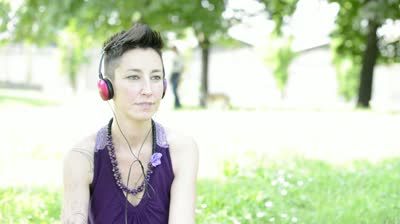
Andrea Rapp in her own Highness.


Scenario #1 - Tobias Samuelsson

Tobias started his day as normal, with a cup of coffee and walking through the museum. Tobias started to think about if people really appreciate the exhibition he created. He wondered how he could receive feedback from the visitors. They have been trying with formulas there people could give their thoughts but the response is very low and lots of the answers are not serious. What if he could track where people are going and for how long they stay at certain spots. Maybe we could use the current surveillance system to track where people are going Tobias thinks for himself.
Tobias keep sipping on his cup of coffee. Since they switched out the old coffee machine to this new one that have one specially good coffee, mixed latte with extra dark sugar and cream Tobias has started to come in early for work just to get a chance to enjoy this new coffee in peace.    
     

Scenario #2 - Tobias Samuelsson

Tobias is sitting at home in gribbylund at his desk, it’s Friday evening and it’s raining outside. He’s writing a report that is supposed to evaluate his museum. The government with Stefan Löfven sent out the request for the evaluation last week and it is due Monday. In the report Tobias is supposed to show different sorts of statistic data regarding his museum, but the only numbers he’s got are the ones regarding the amount of visitors weekly. This is a problem. The government is probably expecting a lot more detailed information. How could he get that information? Tobias starting to Google around for what data there is to get out of museums but doesn't find anything other then data over visitors. 
Tobias think’s it would be great to be able to present more numbers over how the museum is doing other than data over visitors. Perhaps statistic data over all the individual exhibitions and the overall enjoyment of all the different parts of the museum he thinks for himself.   

Scenario #1 - Andrea Rapp 

Andrea is at Tekniska museum with her two children Siri and Birker. It’s a good day to visit the museum because of the humongous rain outside. There are lots of activities for children at the museum, she is looking at her children running around and having great fun but she is starting the feel nervous because they are screaming and are too loud. Andrea is out of focus today because of this. She is feeling that she doesn't have time to experience the museum. Aimlessly is she walking around in the museum and looking out for her children doesn't get to see what she is interested in because of the need to look out for her children. 
Time flies by and they decide to go home and make dinner. A vegetarian soup of noodles and asparagus is on today’s menu. When they are home Andrea can’t remember anything from their visit to the museum and feels that the money she spent for her own entrance ticket was wasted.

Scenario #2 - Andrea Rapp 

Today is a slow saturday just after lunch. The kids are watching TV and Andrea is finishing up the last remains of her meal. Then she got this brilliant idea to spend their sunday doing something together! She wants to go a museum but does not know which one and thus need to find some information. On the internet she finds, via Google, that there are a lot of museums in Stockholm. She aimlessly clicks around to find something that is both interesting to her and the kids while at the same time matches her personal requirements. After a tad bit over 2 hours she has managed to grab hold of a fun museum and has already told the kids and they are excited! If only there was a more optimal way ... 

lördag 14 februari 2015

State-of-the-art Analysis - Alexander Lingtorp


Preface

When visiting Tekniska Museet I arrived early so I had to wait for the others. I went to sit on a bench in the entrance hall near the closed ticket vendor area. While sitting there pondering I noticed how people moved through the area. The entrance area functioned as both a central point in which you could get to all the utility parts of the museum, like the wardrobe and toilets. You could also grab an elevator to other floors in which there were exhibitions. When sitting there I noticed that on the opposite side of the ticket area lay an information wall. Over the course of almost an hour not a single person went or even glanced towards that wall. On the wall hang two large shelves with brochures on Swedish, English, Russian and even Finnish. It was contained maps of both this museum and others in Stockholm. Over these to shelves there were two medium sized television displaying various information. Some covered time limited exhibitions and seasonal events others contained essential information about the museum, for example closing and opening hours. This whole arrangement did not attract a single person, except me of course. I had not choice but to look at it. This is what my analysis will cover, the information to visitors on-site.

Function

The obvious function for the information wall is to bring useful information to the visitor of the museum. We already concluded that the current arrangement does not fulfill the intended function. The problem of their current solution is mainly the placement. The inclusion of both television and brochures are both very nice and friendly towards the visitors. Even the various languages available are plentiful and nice. They might consider adding spanish and/or french but that is a minor improvement considering the main audience is pretty much already covered with the current language selection. Thus the main problem must be that the arrangement does not capture the attention of the visitors and thus render itself useless. The things to change is the position of the whole arrangement or use some kind of attention pointer, a sign for example. It is meant to be found and used and yet not a single person except myself even looked at it. 

onsdag 11 februari 2015

Interviews of museum visitors at Tekniska Museumet

Today our group interviewed one person each at Tekniska Museumet.
When we started sketching the interview questions we referred heavily to the exercise slides. The example questions there inspired our own questions. 

So, from these;

" Who are they?
What do they want?
What motivates them?
What are their goals?
What technical devices and other tools do museum visitors use today? At the museum? Before and after visiting the museum?
What skills/knowledge do they posses?
What information do they need?
What do they want to avoid?
What do they enjoy with the visit?
What type of situation are they in?
What would be convenient for them? "

To, these;
  • Why did you choose to go to a museum today?
  • Is this your first time here? - Yes; Why did you choose this museum over others? - No; What do you find interesting in this museum over others?
  • What do you find interesting in this museum?
  • Is there anything that you think is missing?
  • What do you want out of your museum visit?
The questions above were more as guidelines rather than protocol. We choose to target the parents/leaders of children since the majority of visitors had a more or less direct connection to children.

Transcribed Interview

Below is my transcribed personal interview with a dad.

/ ... / Formalities are cut out ... / ... /
Alexander: "Okej, varför valde du att gå på musuem idag?"
Interviewee: "Jag är pappaledig och ja, behöver något att fördriva tiden med."

Alexander: "Är detta första gången du är här?"
Interviewee: "Nää, jag har varit här ett par gånger tidigare."

Alexander: "Okej, varför har du kommit tillbaka hit i sådana fall?"
Interviewee: "Ja, men det är ju den här digitala utställningen och förra gången var det ju utställningen "GameOn"."
Alexander: "Ah, juste. Den utställningen var ovanligt populär. Så det är utställningarna som får dig att komma tillbaka?"
Interviewee: "Jaa, precis det är det. Speciellt när det är något som intresserar en."
Alexander: "Ah, jag förstår."

Alexander: "Vilken målgrupp tror du det här museumet har?"
Interviewee: "Förmodligen yngre, 20, 30, års åldern. Kanske 40 års ålder, där omkring."

Alexander: "Är det något du tycker saknas på museumet eller på utställningarna?"
Mathias: "Till exempel någon typ av utrustning och sådant."
Interviewee: "Nämen. det är väl framför allt fler datorer än vad det finns på fjärde våningen. Till skillnad ifrån de andra våningarna. De grejerna som är där borta är lite svårare att ta till sig, bland annat kräver de mer tid. Man måste sätta sig ner och ta sig tid."

Alexander: "Vad är det du vill ha ut av ditt museebesök?"
Interviewee: "Jamen, det är ju kul att se alla grejorna där upp [fjärde våningen, utställningen Digital Revolution] och uppfinningar."
Alexander: "Okej, så det är framför allt nöjet som lockar mest?"
Interviewee: "Jaa, precis. Det är det ju. Jag är ju intresserad av det ju [datorer, syftar på utställningen Digital Revolution som vi står vid]. Speciellt allt digital och med film och så vidare. Det är ju kul att se alla häftiga animationer och sådant som de har här."

Alexander: "Intressant, tack så mycket för din tid!"

After talking to the group on their interviews the conclusion we reached is that the majority of the visitors to Tekniska Museumet is either children or people with a technical interest. These two groups together with parent of children and leaders of school classes are the four (two large) groups of visitors. Thus our focus should be on them and their experiences of the museum. The group at large managed to capture these groups in our interviews. Many found, with no intention of, dads with baby carts as interviewees. We also felt that a lot of people were stressed and did not have time for a interview.

Some other points of note is that the place seems popular with children. The interactive exhibitions were really crowded and well used. A lot of the small exhibitions in the museum had some part of interactivity and thus seemed to attract children with both sounds and exciting ways of input.


Here is a picture of me.


PS: In the futuru to see how I look, click the link to get to my Google+ profile. DS:

Andra museumbesöket! #2

Idag, den 11 februari 2015, var projektgrupp och besökte Tekniska Museumet. Under dagens besök gjordes en analys av utställningar samt interjvuer av museebesökare. Vi identifierade flertalet målgrupper av besökare. Bland dessa finner vi; barnfamiljer, skolklasser, ungdomar, dessa var i majoriteten av besökarna.

Personligen satt jag och undersökte vilka typer av målgrupper som kom och gick från museumet. Under drygt en timma satt jag i entren och iakttog hur folk tog till sig information från den största informationstillgången på hela museet.

Den största majoriteten av besökarna på museumet var skolklasser. Därför började jag brainstorma kring lösningar som skolklasser ofta ställs inför. Bland annat observerade jag att ledarna hade svårt att samla alla i en trupp. Därför kom jag att identifiera ett problem och därmed började jag grubbla på hur man kan tänkas lösa detta. Det andra problemet jag hann observera var hur mycket problem barnen hade när de packade ner och upp sina matlådor ur sina ryggsäckar. Alla matlådor tycks vara helt ordinära plastförpackningar från köket. Här insåg jag att det måste finnas ett bättre och smidigare alternativ som är gjort för matsäckar i tanke. Dessa två problemområden samt lösningar skall jag ta upp med grupp och sedan rapportera tillbaka på.


tisdag 3 februari 2015

Konceptualisera Interaktion

Innan man börjar bygga på mjukvara måste man förstå problemrymden, det vill säga hur själva problemet ser ut och hur man skall attackera problemet. Det fel man kan göra är att för tidigt börja tänka på teknologier istället för problemrymden. I sitt team bör man börja med att just definiera problemrymden för det aktuella projektet. 

Genom att gå igenom tillsammans med sina team medlemmar hur man själv ser på problemet kan man undvika att ta något rörande användarupplevelsen för givet. Till exempel att alla vill ha 3D hemma i TV-soffan eftersom det är populärt på bio. Då man som grupp samtalar kan man bestrida varandras antaganden och därmed få fram en åsikt som gruppen som helhet kan ställa sig bakom. Med detta kan man alltså då definiera både problemrymden samt hur man skall gå tillväga för att lösa sagda problem. Nedan är frågorna man kan använda för att väcka diskussion i gruppen.
  1. Finns det några problem med produkten? I så fall, vilka är problemen?
  2. Varför tror du problemen finns i produkten?
  3. Hur tror du att ditt förslag löser problemet i frågan?
Vinsterna med att ha problemrymden klar tidigt i utveckling är många. Bland annat kan man få en delad grund inom designen och därmed undvika förvirring. Allt ovan är precis vad som behövs i början av ett sånt här projekt då just förvirring kan vara ett ständigt återkommande problem. 

måndag 2 februari 2015

Fältstudier på Nordiska muséet

Vi gick tillsammans till Nordiska muséet på Djurgården och genomförde en smärre fältstudie. I takt med observationerna diskuterade vi möjliga idéer och koncept, och fick dessutom tala med museivärden Pernilla Jansdotter som berättade om hur systemet fungerade och vad som kunde förbättras (datorer, telefoni, etc). Detta markerar vårt första steg i kursen.

Emil kunde tyvärr inte följa med, då han var sjuk.

Medverkande (fr. v. t. h) Kennet Runnman, Alexander Lingtorp, Eric Hallström, Leif T. Sundqvist, Mathias Björkman